
Staging XR Scenes
Keep doing your crappy little drawings…
Some people create beautiful perspective illustrations to visualise and storyboard their virtual reality designs… And it’s tempting to think you’re not a strong designer if you’re not doing that too…
But is it actually necessary?
As I’ve shown in the previous articles in this series, storyboarding for linear narratives in XR media (VR/AR/MR, etc) doesn’t fit very well into traditional storyboard techniques. But that doesn’t mean we need to jump straight onto computers or become professional illustrators.
In this article, let’s look at how to roughly layout our scenes and consider what details are important and why.
Note that this article is continuing a series.
In the first article, Designing Immersive Experiences, we touched on the general frictions of designing for virtual reality, and in the second, we looked at a lo-fi technique for Focal Point Blocking we called a Sequence Diagram.
In this article, we’ll look at how to depict more detail in each scene with what we’ll call an Action Diagram. You can start here if you want to.
Aerial view, of course
When considering layout in a scene, the straightforward answer, is to draw some sort of aerial view. An aerial view allows us to draw all of the important elements without having to tangle with perspective or draw multiple views.
Pretty straight forward, but let’s dive into the details and quirks.
The action diagram
Formalising this format, a diagram can easily be created of a scene that depicts the layout of objects at one instance in time or their actions across the shot or scene.
This is what I call an Action Diagram — One of the main artefacts for describing an immersive scene.
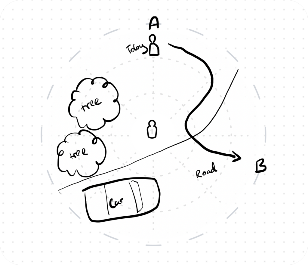
If we relate the action diagram to the previous article’s Sequence Diagram (Which details focal point blocking with rings and dots), we should note that the action diagram represents one ring in the overall sequence and provides far more detail regarding the action within that ring.
Below, the Sequence diagram is on the left, and the Action diagram for the highlighted shot (Shot 4) is on the right. The Sequence Diagram for shot 1 (A to B) is the image we’ve already seen above.
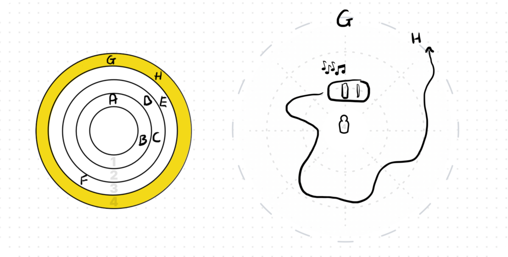
You’ll see that the letters on the Sequence Diagram (which describe where the focal points start and end in each shot), are echoed in the Action Diagram for that shot. The Action Diagram, however, provides detail of the layout in each shot is as well as optionally showing how those focal points might move throughout the shot.
In some instances, action depicted can spread across more than one shot in a sequence. In which case, so would the Action Diagram.
Aerial view? Not quite
Taking a step back to how we draw the Action Diagram, we can note that an aerial-like view can come in a few different variations. For instance, we could draw it perfectly top down, in perspective, or in isometric.
Each style of aerial drawing has it’s benefits…
- Top down is very easy to do, but it’s harder to understand (harder to provide useful detail).
- Isometric, or a similar perspective, is a lot easier to interpret as a viewer, but requires more proficiency as an illustrator.
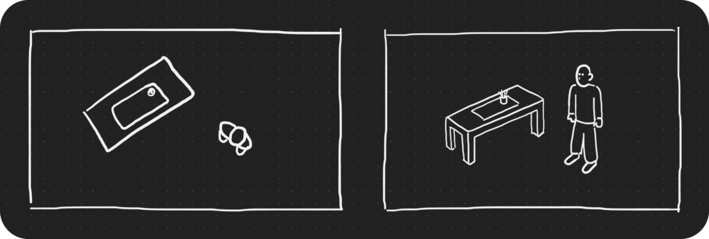
Drawing in anything other than perfect top down, also means consciously managing the visual order of your elements. This means that if one object should sit behind another according to the perspective, you need to plan for that, either drawing the front object first, or by leaving space when drawing the object behind — Or having to erase lines to correct the overlap.
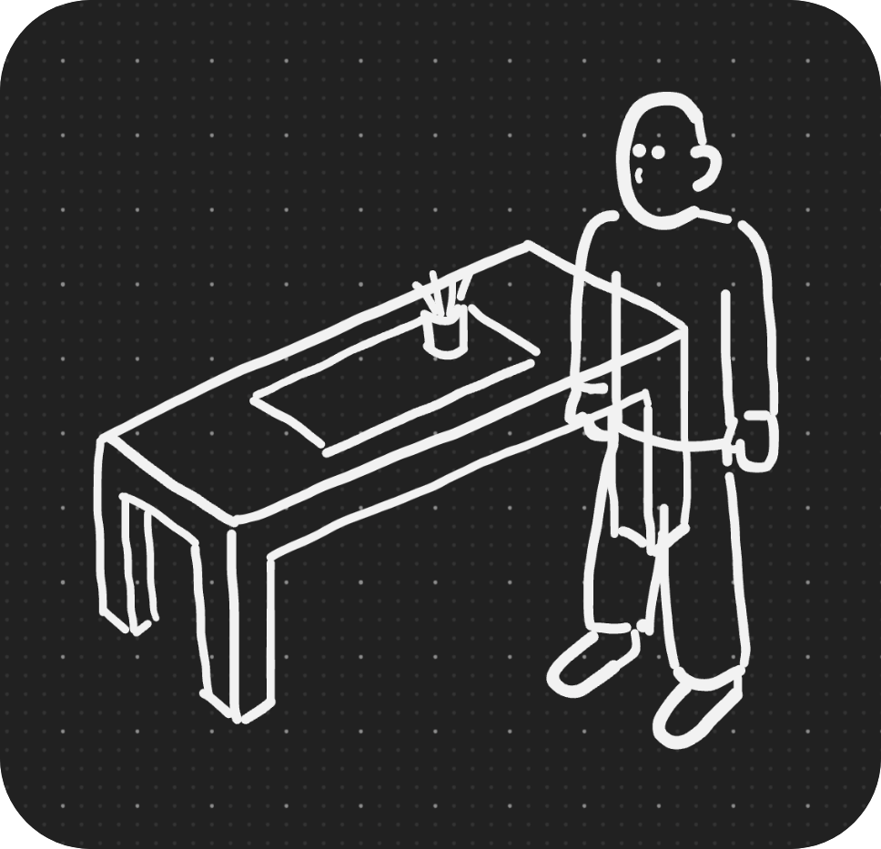
Quirks like these can impact how fluidly we can depict and explore our ideas. Sometimes because we’re not experienced illustrators, but more often because the process of designing means we’re still figuring out what the scene should look like, and therefore can’t successfully plan for the most efficient drawing approach.
Remember, we’re specifically designing artefacts for use before you get on a computer. Something you can do on the fly, on paper, a tablet, or even a napkin if necessary.
Permission to be inconsistent
When designing a versatile approach, therefore, we can instead use the best of both worlds.
Top down drawings are easier, while perspective or front-facing-views often provide easier interpretability, and there’s often no important information lost if both of these are combined inconsistently in the one drawing.
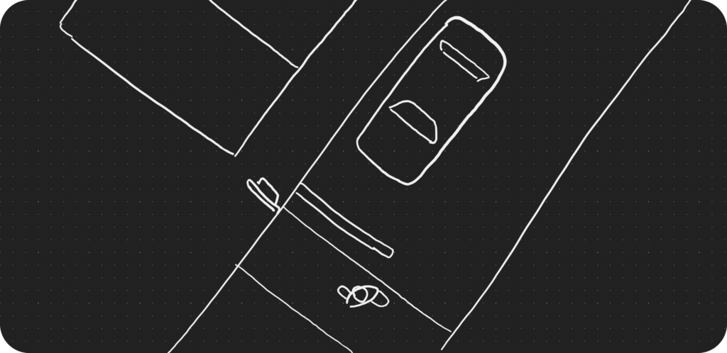
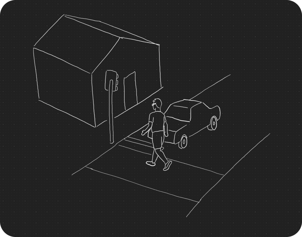
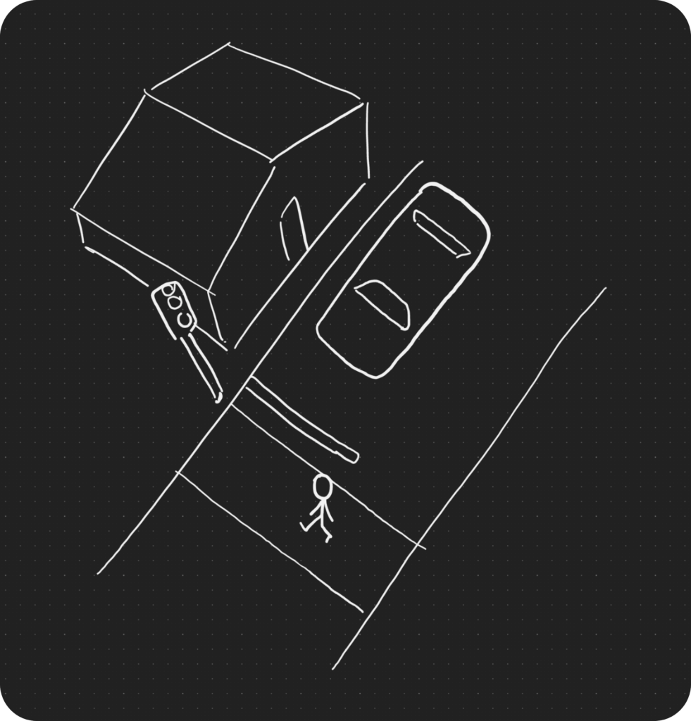
This approach can make for an unrealistic drawing, but remember that a realistic drawing isn’t what we’re trying to achieve with this kind of storyboard. The most important thing at this stage is communicating ideas for discussion and documentation. Perhaps even pitching to stakeholders.
So while the overall layout is based on top-down, within that, each object can be drawn front on, on an angle, or in whatever way is the quickest and clearest to create an easily understandable depiction of your scene.
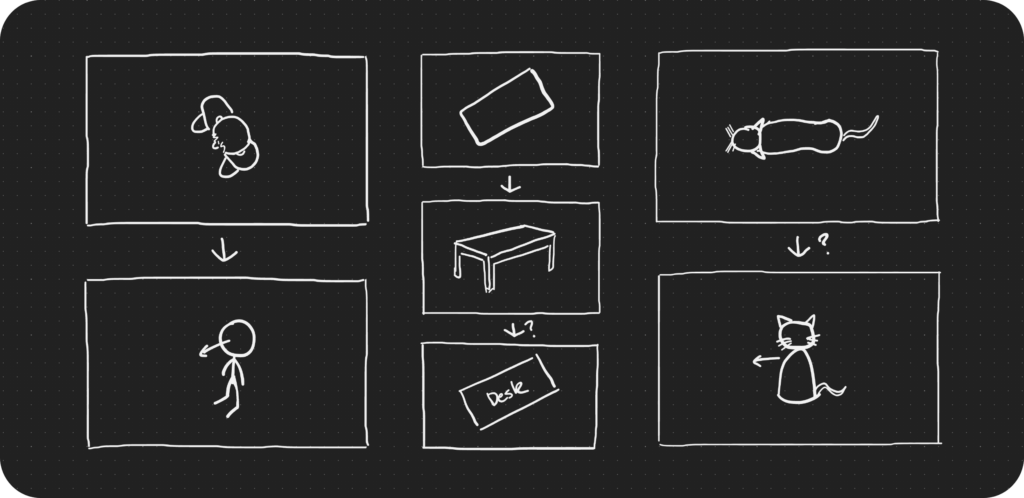
Use labels if you have to
Looking at the desk example above, a simple top down view doesn’t adequately convey that the object is a desk. Drawing it in perspective, as an icon of a desk, while not that difficult also takes up unnecessary time. A great middle ground, in this instance, is to simply label it with the word desk.
Similarly, the top down person is a bit difficult to depict clearly if drawn straight top down, but converting it to an angled icon also reduces clarity on which way the person is facing – So it’s labelled with an arrow from their face to reduce confusion.
Mixing perspective and adding labels is likely what a lot of people do naturally. So it’s not ground breaking. If that’s you, stop being ashamed of your crappy drawings. They do the job very well.
A balancing act
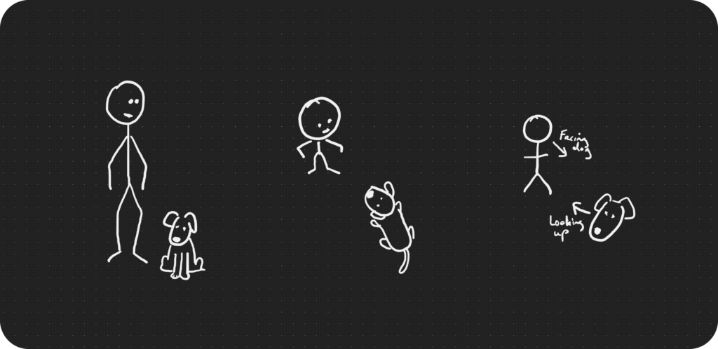
While this makes for a faster approach to roughing out your scene, there are caveats to keep in mind. When deciding how an object can be depicted, be wary of drawing the object in a way that degrades interpretability instead of increasing it.
For instance, if it’s important that a dog is facing a person in your scene, then simply drawing it front-on as an icon doesn’t convey that. You’ll instead need to draw it in a way that makes that clear, either with more realistic perspective or with clear annotations.
High fidelity when necessary
At times, a concept needs to be presented back to a stakeholder (A director, an investor, the crew, etc.), and depending on the stakeholder, this might need to be of a much higher fidelity and level of accuracy. And that’s where you’ll want to move being this type of diagramming.
You’ll need to recognise when this is necessary and when it isn’t so that you can allocate your time and resources usefully.
One of the additional benefits of starting with lo-fi artefacts like these, however, is that they can be given to a professional illustrator at any time, and all the information should be there for them to know how to create polished concept art for you.
Starting this way makes the delegation easier!
Some helpful structure
This series of articles grew out of the need to create templates and guides for media creators at Swinburne University. As such, I’m covering immersive media design recommendations as well as design choices related to building the frameworks.
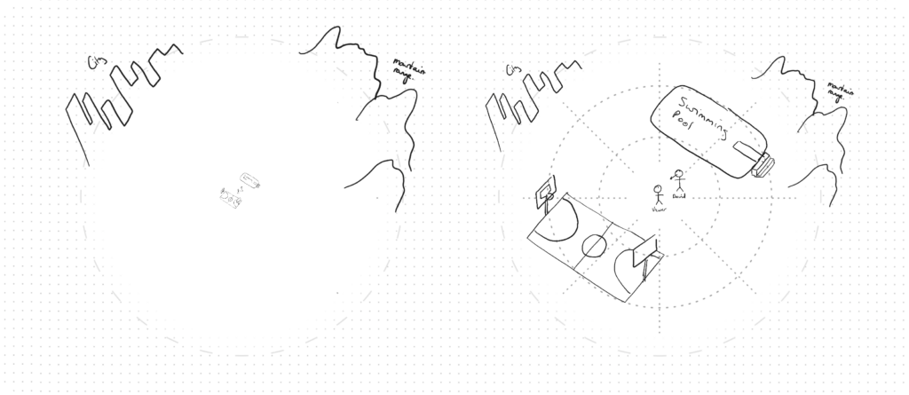
Below is our empty Action Diagram that can act as a base for the diagramming. It includes some structural guides to help designers get started, so let’s have a look at the design choices around it and how and why they help.

Three Distance lines
On the artefact above, you’ll notice three dashed circles or varying sizes. These lines help the person drawing, and the reader, understand distance.
We designed these to not be too prescriptive. Sometimes the scene may be huge, so the person drawing may choose to use them to depict hundreds of metres. Sometimes the scene will be intimate, and it will help delineate much closer objects.
In my experience, the bands are most useful to indicate what’s close to the viewer, what’s in the middle-distance, and what’s in the far distance. Another way to describe these is person space, action space, and vista space, which was previously articulated by DreamWorks — Terminology that beautifully articulates the utility of these spaces in immersive media.
This simple categorisation as lines can also be useful for managing scale. If you draw everything to scale you’d probably end up with objects too small to interpret and a lot of empty space in-between. Instead, just roughly placing them in these bands will allow you to easily convey a large portion of the necessary distance information, while minimising the dead space.
Direction lines
The lines that are perpendicular to the circles and spreading out like spokes are included to help indicate where things are around the viewer a little more explicitly. Working roughly often means these directional lines aren’t pivotal, but having them available can sometimes help you be consistent and more clearly show where something sits around the viewer.
Tying it all together
There’s a tendency for people to try and make these kinds of diagrams more sophisticated and realistic, however, most of of the time, the ease and intuitiveness of simplistic drawings are the most appropriate approach.
As such, I hope this article helped clarify the important aspects of the approach, when it’s appropriate or not, and give you permission (if you need it), to keep doing your “Crappy Little Drawings”.
Remember, the Sequence Diagram and the Action Diagram are useful tools for focal point blocking at different levels of detail, but they work best when used together as an Immersive Media Storyboard. In the next article, we’ll look at exactly that.
Further Reading
- Storyboarding in VR at DreamWorks talks about personal space, action space, and vista space and how important those are to virtual reality and other kinds of extended reality.
I invite you to subscribe if you’d like to receive this series directly to your inbox and support my writing.
Read Part 4:
Storyboarding Immersive Experiences
Thanks…
I dissect and speculate on design and development.
Digging into subtle details and implications, and exploring broad perspectives and potential paradigm shifts.
Check out more like this on Substack or find my latest articles below.
You can also find me on Threads, Bluesky, Mastodon, or X for more diverse posts about ongoing projects.




Leave a Reply