Improve kanban readability in Jira
While working in Jira’s kanban boards, I always found that over time visual noise would build up. At times this was partly because the team was still ironing out it’s processes, but even without that, it was busier than I would like.
So I decided to make some small CSS tweaks to clean up the interface. I’ll provide the code and screenshots below.
The problem
In the screenshot below, you’ll notice that we have 3 columns in our kanban board, and in this board, only the middle column is what we spend 90% of our time on. The first column is only important when we are ready to pick up new tasks or planning our schedule, and the last column is very rarely useful (for the design team) as we’ve completed everything in it by definition.
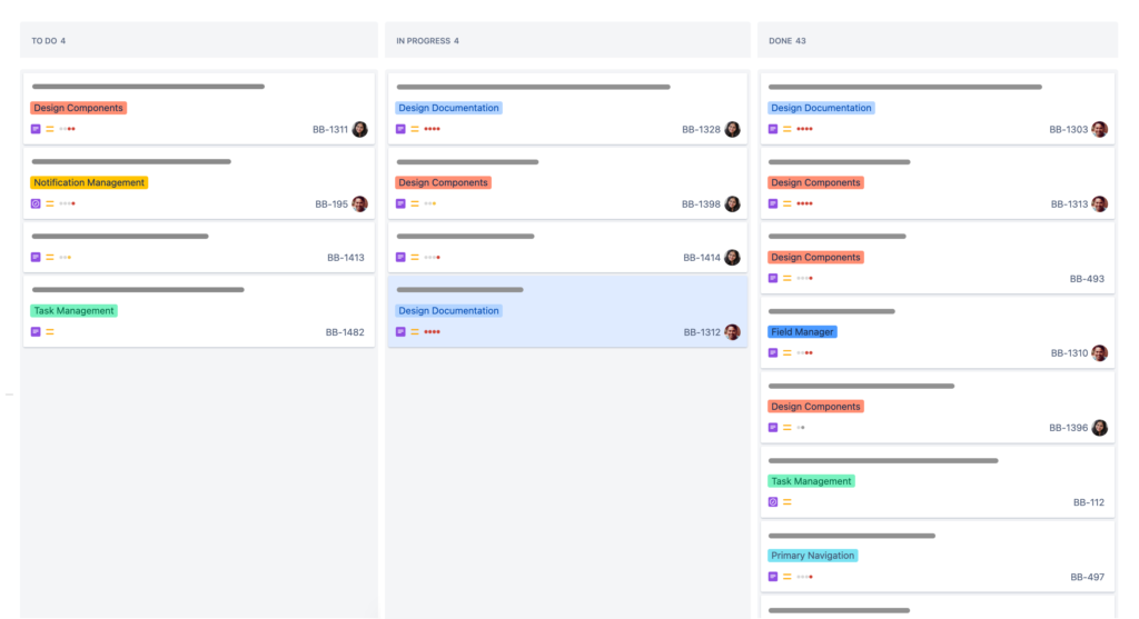
Forgive the grey bars in the image, I had to redact them. Imagine the grey bars are the title of each card.
All of this creates a lot of visual noise while we’re look at the board. And because the product team related to this screenshot is still figuring out the processes around removing tickets from the board, a lot of vertical scrolling is occurring purely from the overflow of tickets in the right column—Which are the least important tickets on the board for the design team.
The solution
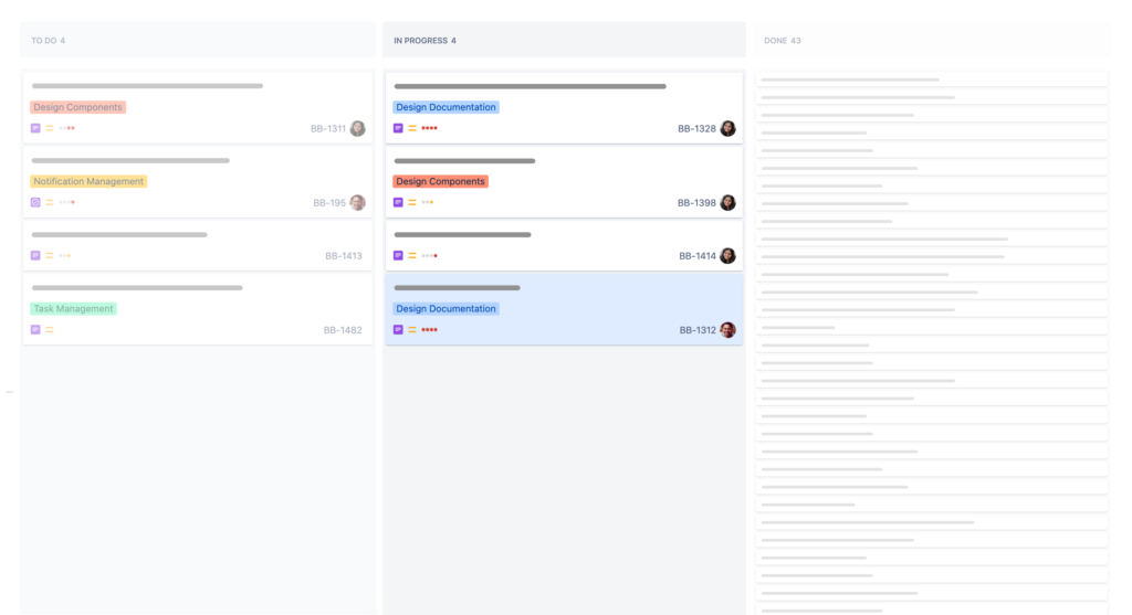
To fix this, I created the CSS snippet shared lower down in this article. What it does can be seen in the screenshot below. Here you see that the first column has been de-emphasised, but the usual detail in the tickets is preserved for when it’s important. While the last column is both de-emphasised and each ticket has been cropped to reduce the vertical space it takes up and hide it’s details.
Applying the code
To apply the code, you’ll need to install a browser plugin that allows you to add additional CSS to a page (I also hear Arc browser can do this kind of manipulation natively, but not sure if it will take raw CSS like below).
I use the plugin Stylebot, which is on Chrome, Edge, and Firefox, but there are other similar plugins out there too. Try Googling “Custom CSS” if you can’t find one.
Once Stylebot is installed, you may want to restart the browser to be sure it all works properly. After that, open your Jira kanban board and the click on the Stylebot button in the browser and Open Stylebot.
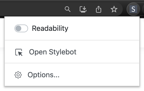
In the pane that opens on the right over your page, you should see three tabs down the bottom. Click on code.
The other tabs let you tweak styling of pages without code (but are more limited), while we want to paste in something custom.

You’ll then see a big white space to paste in the below code.
Note that this code assumes the done column is the last on the right and the other column you want to de-emphasise is first on the left. The styling will still occur no matter what or how many columns you have, so it’s up to you whether it works well for you.
li.ghx-column {
/* background-color: rgba(50, 50, 150, 0.08) !important; */
}
li.ghx-column:nth-of-type(1) {
background-color: rgba(0, 0, 0, 0.02) !important;
opacity: 0.5;
}
li.ghx-column:last-of-type {
background-color: rgba(0, 0, 0, 0.02) !important;
opacity: 0.5;
}
li.ghx-column:last-of-type .ghx-newcard {
padding: 0.3em 0.6em;
max-height: 1.3em;
font-size: 0.8em;
overflow: hidden;
}
li.ghx-column:last-of-type .ghx-newcard section {
text-overflow: ellipsis;
overflow: hidden;
white-space: nowrap;
}That’s it!
I hope it worked for you, but because the Jira developers might change the underlying code of the page, this could break. Let me know if it does and we can either update the code or add a note for others.
Thanks…
I also dissect and speculate on design and development.
Digging into subtle details and implications, and exploring broad perspectives and potential paradigm shifts.
Check out my conceptual articles on Substack or find my latest below.
You can also find me on Threads, Bluesky, Mastodon, or xTwitter for more diverse posts about ongoing projects.





Leave a Reply