Evolve Hack:
Highlighting the Reset/Retry Button
In this article, I’ll describe a particular issue I often needed to solve in Evolve Authoring and provide code that you can copy and paste to solve it too.
To apply the code, you’ll need to refer to my article Applying Your Hacks, and for full context of why hacks are necessary, and the pros and cons of using them,you can refer to Hacking Evolve Authoring.
When you add a Multiple Choice Question (MCQ) or Graphical Multiple Choice Question (GMCQ) in Evolve, a button can be can shown that allows users to reset the question and try again. These reset buttons, however, tend to blend in, so I created this hack to help them stand out.
Start with an MCQ or GMCQ
In your MCQ or GMCQ, first allow the user to have multiple chances to try the question by setting it’s attempts field to something other than 1 in the Behaviour tab. Unfortunately, if the user gets the question wrong, while the button will now show, the button has the same colour and style as normal submit button, so it blends in and can go unnoticed. This is especially problematic if the question must be tried in order to proceed, as it can leave the user searching around the page for what they’ve missed.
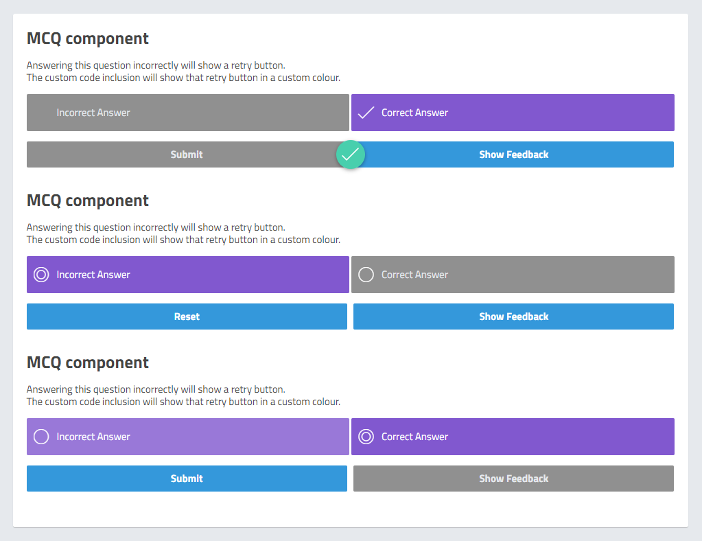
You can see this problem in the below screenshot. Three MCQ’s are on the page in different states; The first submit button is greyed out because it’s correct (and so the user cannot redo it), however, the second and third questions are in different states – The second question has been answered incorrectly, while the third question hasn’t been answered at all.
Unfortunately, since feedback and submit buttons are the same colour as well, it’s very easy for the user to overlook the reset button.

The hack
There’s no way to change the retry button colour in Evolve, so here’s some custom code I created to change the colour when I was working in Evolve. Note that this relies heavily on the JavaScript in the Evolve Customisations Template I created, and thus won’t be previewable while editing in Evolve – it will onlly be viewable once you’ve exported and added in the template file. However, follow my article Applying Your Hacks and you’ll find this hack isn’t much more complicated to implement than the usual CSS hacks.
Some prep required
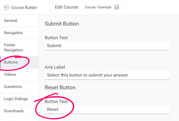
Once you’ve added in my Evolve Customisations Template, the colour change is turned on by default, however, the hack searches the page for buttons with “Retry” text, which isn’t the default text Evolve shows on this button (The default is “Reset”). You therefore need to change the default reset button text to “Retry” or edit the hack to search for different text.
Note: I programmed it to use “Retry” because that’s what I always used on my courses. I did this because I decided “Reset” could be a bit more ambiguous for users relying screen readers and would make clicking the button feel risky.
Consider tabbing through interactive elements on the page as a blind user, if you encounter a button named “Reset”, will you be confident of what will be affected by clicking it? Will it reset the course? Your position on the page? Or something else? You can’t be sure since you don’t have the visual context. “Retry”, however, is a word that more specifically implies a relationship to a component you were required to interact with (ie. an MCQ).
This isn’t a perfect solution, however, an in an ideal world I would want the button to say “Retry this question”, or something similar, and upon clicking it, change the focus of the screen reader to the start of the question. But I think this small change still helps.
I’ll discuss my common changes to default Evolve text in an upcoming article.
Change the course to use “Retry”
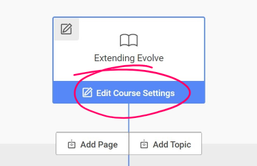
To edit the default button labels, click on the Content tab to go to the Course Builder. From there, click on Edit Course Settings under the first node.
Note: this is different to simply clicking on the Settings tab.


Or, change the hack to look for “Reset”
If you want to continue using the default text of “Reset” instead, or you have changed it to something else entirely, then you’ll need to update the JavaScript template code so that the hack will be able to find it.
In the template code, open the file this-course_customisations.js and edit the below line to refer to the exact text that appears on the button in your course. Only edit the text between the quotation marks and be exact with spaces and casing.
const retryButtonText = "Retry";Change the button colour
Since the hack changes the color of the button, to customise the colour you need to go to the same file (this-course_customisations.js) and modify the hexadecimal colour it uses.
const retryButtonColor = "#ff0026";Turning it off
If you’ve added in the Customisations Template but don’t want this particular hack to apply, you can turn it off by editing the below line in the file this-course_customisations.js
changeRetryButtonColor();Just delete that line, or add 2 forward slashes before it so that the browser ignores it.
// changeRetryButtonColor();That’s it!
While that worked for me, that doesn’t mean it will still work for you. Evolve updates often, so always be sure to test the code before you use it and any time you export. Evolve may have even added the ability to change this colour in the standard course the settings by the time you read this article.
Refer to my article Applying Your Hacks, for info on testing and exporting.
Thanks…
I also dissect and speculate on design and development.
Digging into subtle details and implications, and exploring broad perspectives and potential paradigm shifts.
Check out my conceptual articles on Substack or find my latest below.
You can also find me on Threads, Bluesky, Mastodon, or xTwitter for more diverse posts about ongoing projects.


Leave a Reply