
Designing immersive experiences
To paraphrase Jessica Brillhart, there’s an attention problem in VR narrative media.
In late 2023, this was an issue I was deeply focussed on. I was building content to help students at Swinburne University storyboard and plan their immersive media projects. The output of which was a series of templates that the students could lean on for their work.
…But far more thought and consideration went into them than was visible.
In this article, therefore, and the several that follow it, I’m going to tease out many of the underlying considerations when designing immersive experiences like Mixed Reality (MR) and Virtual Reality (VR) —Collectively referred to as Extended Reality (XR)—As well as how that manifested as a set of tools for designing in XR.
XR is a popular term these days, but don’t worry, this blog isn’t becoming an XR blog. It’s still a general technology and design blog, and that means including XR from time to time.
Let’s dive in.
The attention problem in XR narrative media
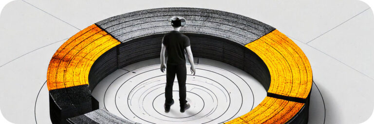
In traditional media experiences, like cinema, TV, or even the more modern phone screen, the media has limited real estate and always sits in front of the viewer. This means the media is entirely within their field of view by default. Immersive media is different. It can include content that sits around the viewer in directions they aren’t necessarily looking at the time—or possibly ever.
This ability to choose a direction to face is a basic level of interaction afforded by immersive media that sacrifices whatever the viewer chooses not to look at.
It’s an important consideration in highly interactive media like games, and can be mitigated or used to great effect by considered audio design. For experiences that have no additional interactivity, though, like a VR movie, the direction a viewer may or may not be facing becomes even more integral to the cinematography.
Designing immersive media narratives, therefore, requires careful consideration of where a user’s attention might be, and their field of view.
These are what traditional storyboards partly help consider for 2D media, however, their format doesn’t lend itself to easily solving similar issues when the media is more immersive.
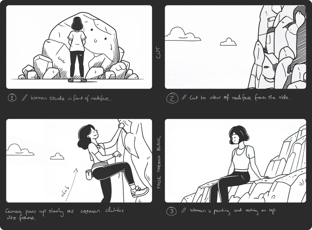
The traditional storyboard
Storyboards for 2D media help consider the staging of items within each shot throughout the scenes. In doing so, a reader can consider how the narrative is playing out and whether it’s reinforced by visuals that help to guide the user’s attention to the important elements.
How the staging affects the viewer, however, partially depends on the size & proximity of the screen to that viewer.
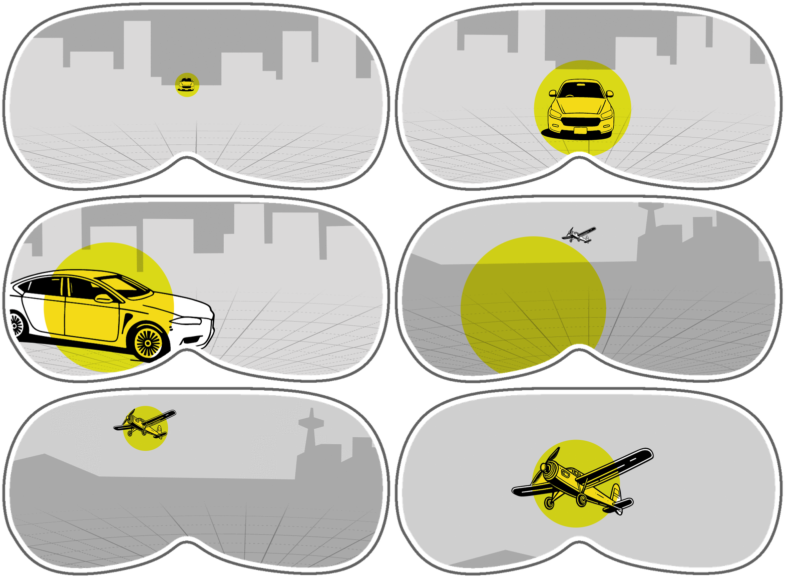
The size of media relative to your field of view can mean small eye movement, large eye movement, or even head movement. And the larger the movement, the longer the time delay before you find the new point of interest.

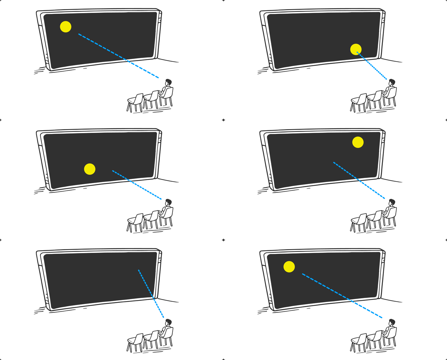
When considering how significant focal point movement effects the viewers experience, at best, in slower-moving scenes with longer shots, the viewer is subconsciously asked to search the screen to find the next point of interest. But at worst, in fast-moving scenes with quick shots, a viewer may not have time to find the next point focal point, and as a result, may miss something entirely.
This effect can drastically change how someone experiences the media. Missing something may mean they don’t understand a subsequent plot point or a character’s motivation. Their understanding of the media could, at most extreme, be drastically different.
Three scenes shown with the viewer’s likely focus highlighted…
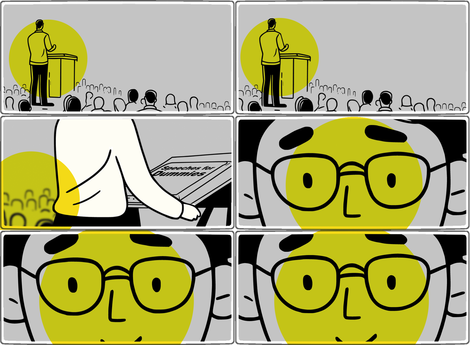
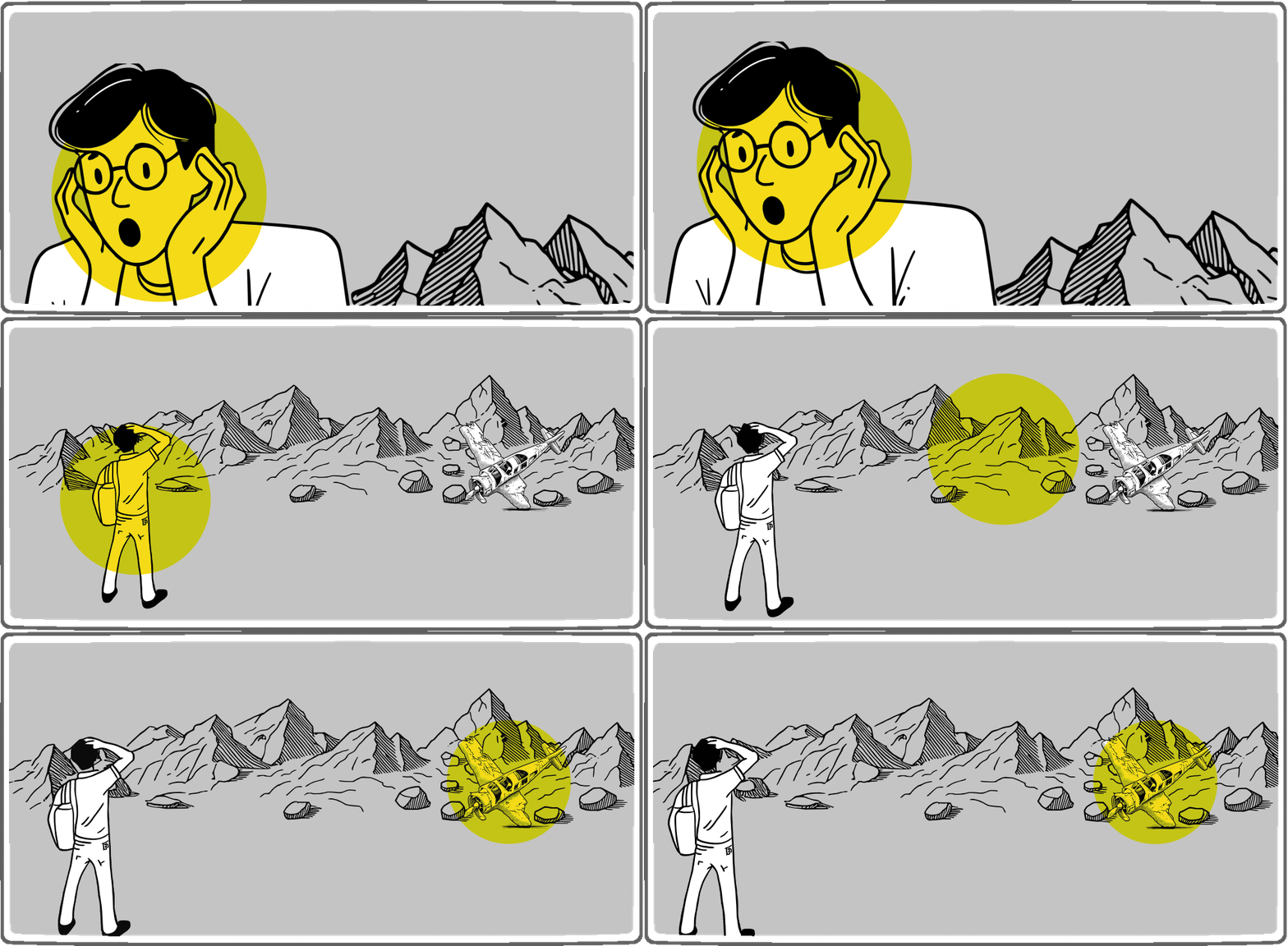
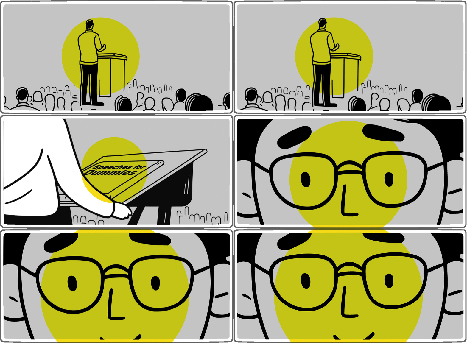
As media becomes larger, the impacts of these effects become larger as well. And yet, while traditional storyboards do allow us to consider the impacts on large screens, they start to break down when the media becomes immersive.
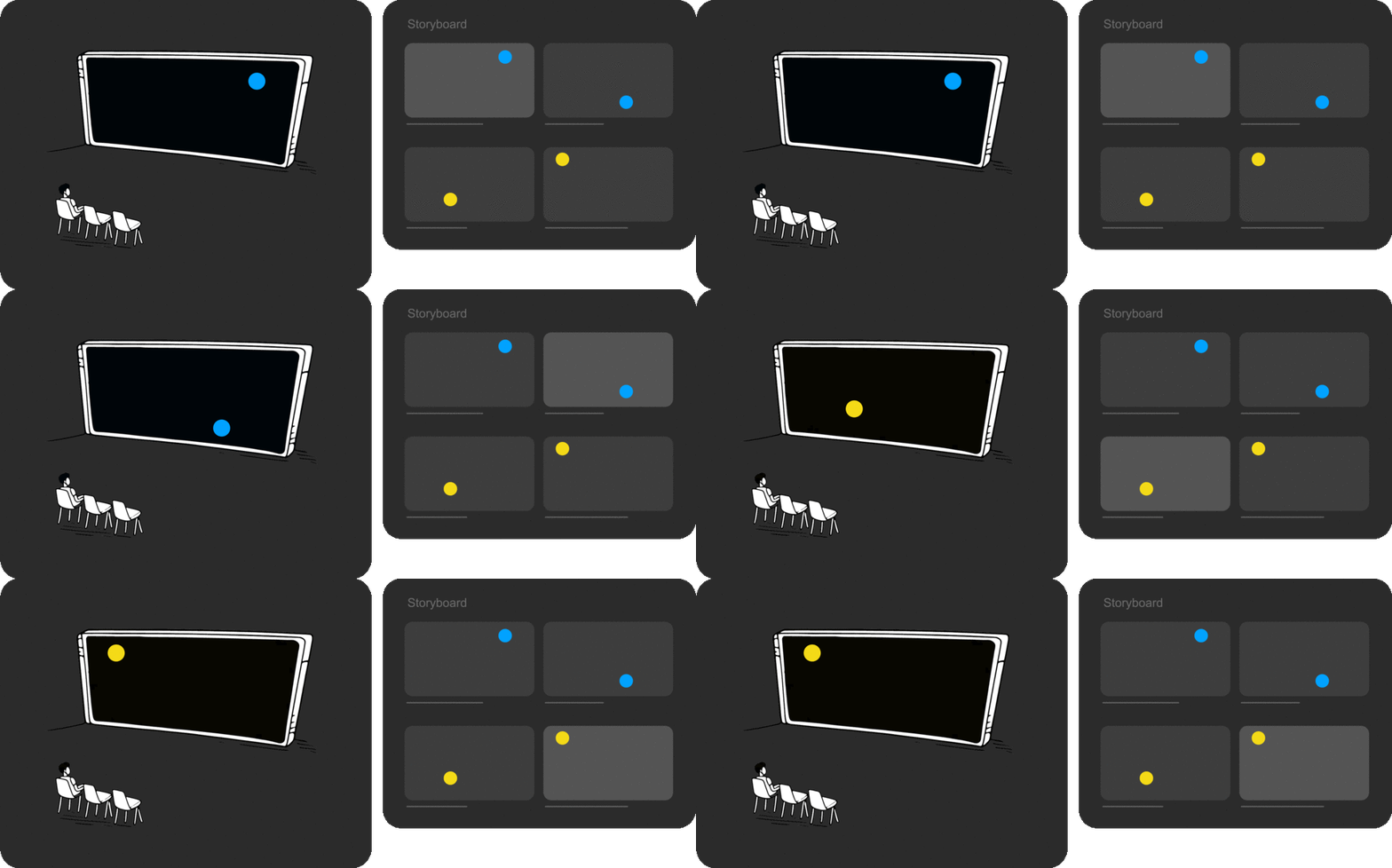
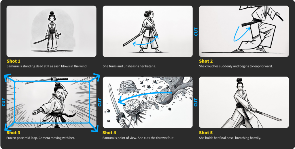
Shown with the movie’s storyboard frames.
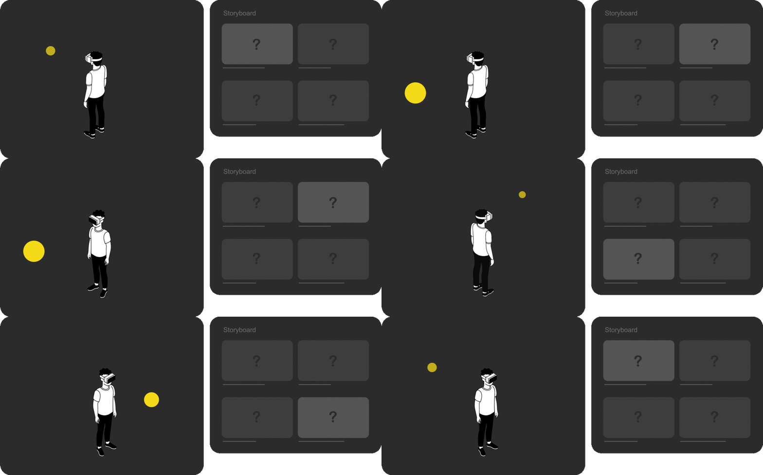
How would a storyboard be depicted for this?
Storyboarding for immersive media
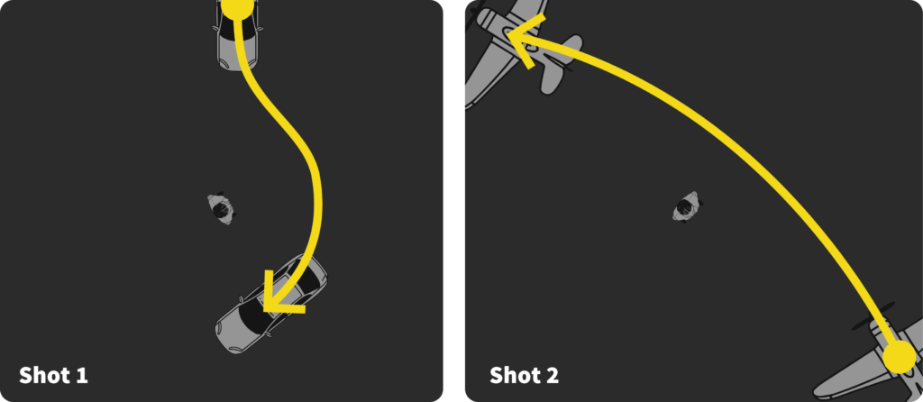
Imagine a scene in which a car is driving up directly in front of the viewer. It then moves past them to the right and ends up slightly behind them.

The above example shows the intended focal point of the scene changing throughout the shot. By designing it this way, our goal is likely for the viewer to keep their attention on that moving focal point and have them rotate their head and body.

If the scene then cuts to another shot, in which a plane flies over head, it matters where in the scene the plane appears. If it appears behind the viewer, they’ll be facing the wrong direction to see it. But if it appears in the same direction the car was, then they’ll notice it very quickly.
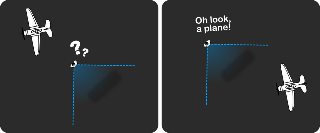
Two types of focal point changes
In the examples above, we’ve seen two types of focal point changes that are important throughout any media. 1. Changes within a shot (ie. The car driving around you or plane flying over you), and 2. Changes between shots (ie. The scene change from carpark to airport).
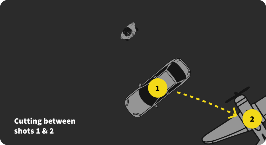
Traditional storyboards can depict both of these simultaneously (Action within a shot, and the action across cuts), but when the media wraps around the viewer, it becomes difficult to adequately show both in one storyboard.
Immersive media does, at times, still benefit from traditional storyboard framing, however, because the cinematographer can’t ensure the viewer will look in the direction depicted, the storyboard’s use is limited.
Where to from here?
Solutions to this XR design problem are best broken into several separate problems, so to prevent this article from becoming too long, I’ve only sought here to clearly define the core issue.
This is the first in a series of articles, however, in which I’ll be discussing various approaches to designing for immersive media.
In the next article, we’ll touch on and extend the work Jessica Brillhart started several years ago (What I’m calling Focal Point Blocking). We’ll then move on to combining that with detailed storyboarding, wireframing environments, and wireframing interfaces.
Finally, this series of articles is born out of work I did for Swinburne University of Technology in Australia. James Berrett from Swinburne commissioned me to design printable templates and tutorials for some of their Immersive Media subjects. We put a lot of thought into how the templates were designed, so I hope these articles give you an understanding of both the design challenges in immersive media as well as some considerations when creating and iterating template style resources.
I invite you to subscribe if you’d like to receive this series directly to your inbox and support my writing.
Read Part 2:
Focal point blocking for XR media
Thanks…
I dissect and speculate on design and development.
Digging into subtle details and implications, and exploring broad perspectives and potential paradigm shifts.
Check out more like this on Substack or find my latest articles below.
You can also find me on Threads, Bluesky, Mastodon, or X for more diverse posts about ongoing projects.




Leave a Reply