Evolve Hack:
Restyle MCQ Ticks and Crosses
In this article, I’ll describe a particular issue I often needed to solve in Evolve Authoring and provide code that you can copy and paste to solve it too.
To apply the code, you’ll need to refer to my article Applying Your Hacks, and for full context of why hacks are necessary, and the pros and cons of using them, you can refer to Hacking Evolve Authoring.
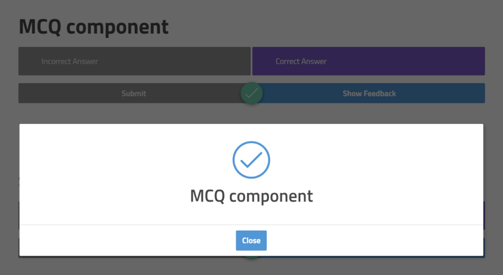
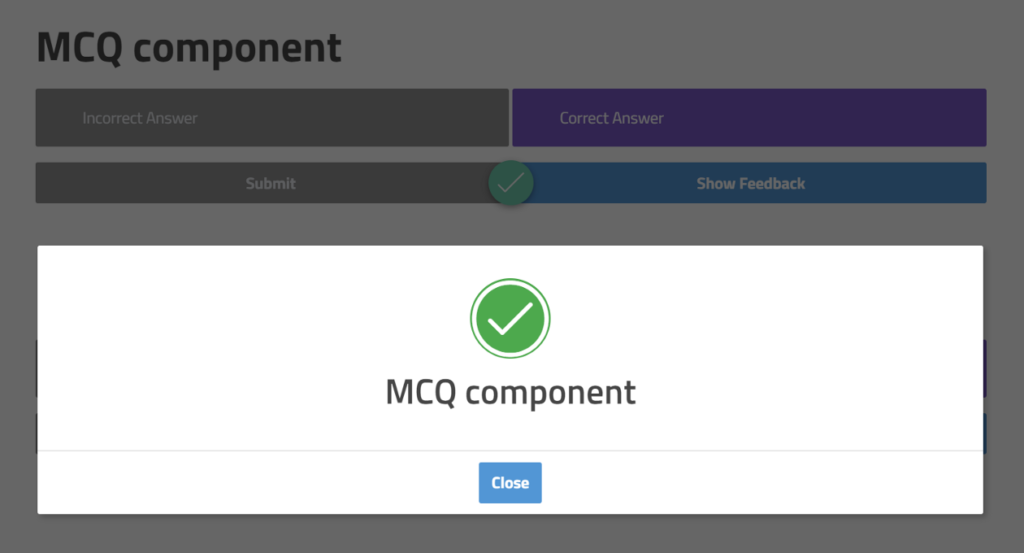
When creating an MCQ in Evolve, two forms of feedback will appear when a user answers the question – a tick or cross will appear between the submit and feedback buttons, and a popup dialog will appear containing feedback with an additional tick or cross.
Feedback I once received from a client was the question “Can we make those two ticks or crosses match in colour and style”. This was a fairly small request, but it did seem preferable to me as default behaviour for any course. So I created a hack to do so.
Start with an MCQ
Create an MCQ that has a limited number of questions and feedback turned on. You can then adjust the colour of the in page ticks and crosses in the theme settings. You can also change the colours used in the popup dialog ticks and cross, however, you can’t make the tick and cross int he popup have different colours.
This means your ticks and crosses in the popup dialog will a different style to the version you can see in the background. It also means that the colour in the popup doesn’t reflect whether the answer was correct or incorrect – and thus is not immediately identifiable at a glance.

The hack
With some CSS, we can alter the colour and styles of these icons individually…

Below is the custom CSS for you to copy and paste. Be sure you change any of the settings that you’d like so that the colours are styled consistently with your course.
/* Fill Notification Dialog Icons */
/* Updated: 04/08/2020 */
.ev-notify .ev-notify-icon .ev-icon
{
	color: #fff;
}

/* tick icon settings *?
.ev-notify .ev-notify-prompt.ev-is-correct-feedback .ev-notify-icon .ev-icon
{
	color: #fff;
	background-color: #00ac3e;
	border-radius: 100px;
}

/* cross icon settings *?
.ev-notify .ev-notify-prompt.ev-is-incorrect-feedback .ev-notify-icon .ev-icon,
.ev-notify .ev-notify-prompt .ev-notify-icon .ev-icon-cross-circle.ev-icon
{
	color: #fff;
	background-color: #ff0026;
	border-radius: 100px;
}
That’s it!
While that worked for me, that doesn’t mean it will still work for you. Evolve updates often, so always be sure to test the code before you use it and any time you export. Evolve may have even fixed this issue by the time you read this article.
Refer to my article Applying Your Hacks, for info on testing and exporting.
Thanks…
I also dissect and speculate on design and development.
Digging into subtle details and implications, and exploring broad perspectives and potential paradigm shifts.
Check out my conceptual articles on Substack or find my latest below.
You can also find me on Threads, Bluesky, Mastodon, or xTwitter for more diverse posts about ongoing projects.


Leave a Reply