Using Lottie Animations in Storyline 360
While Articulate Storyline provides basic animation tools, there is often a lot to be desired. With various brute-force methods, complex animation can be created, but often certain techniques are only realistic in other software.
This means intricate animation is often imported in as video or as animated GIFs, or animation is dumbed down to suit (often in an overly complicated way). The below article looks at an alternative format to videos and GIFs. A method of embedding After Effects animation as Lottie files. It also includes a few downloadable Storyline and After Effects examples that you can try yourself.
What is a Lottie animation?
Incase you haven’t heard about Lottie before, a quick summary would be vector animations that play in the browser through JavaScript. They are often much higher quality than videos and GIFs while also being much smaller in file size. I’ve a included a couple of examples below, but you can read about Lottie in more detail in my article What is a Lottie Animation.
The above Lottie animation was created by PuliGraphics
The above Lottie animation was created by Daris Ali Mufti
Using Lotties in Storyline 360
Lottie animations are not natively supported by Storyline and require a little preparation, which means they’re not suited to every situation. When suited though, they can allow faster animation development, at higher quality, and with lower file size. Animations that involve complex parenting, nested compositions, or even inverse or forward kinematics (character animation) can all be exported from After Effects while maintaining their vector format and transparency.
Setup
To use Lottie animations in Storyline 360, the steps are as follows:
- Find a stock Lottie animation on one of the available stock sites.
- Alternatively, create an animation in After Effects yourself.
- Prepare an HTML file to display and play the Lottie file.
- In Storyline, insert a Web Object and select the folder that contains the index.html file from step 3.
- Size the Web Object to the appropriate size.
- Publish the project for web or to Review 360 to see Lotties in action.
The first 3 steps are fairly straightforward and described in the linked articles above, however, once in Storyline, there are a few gotchas. The main issue of note is that Lottie animations won’t be visible while you are actually editing. They will, instead, look like a big grey box.
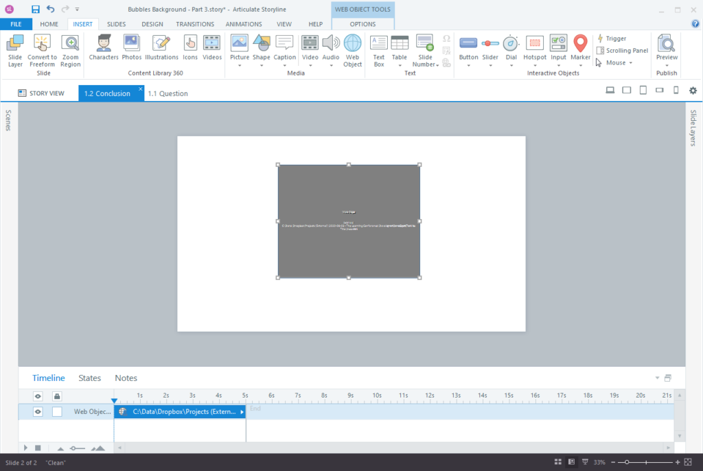
To view how a Lottie animation looks in the page, therefore, you must export your project either to Review 360, or as a Web Project with the process demonstrated int he video below. Simply clicking the preview button won’t work because of limitations that browsers often have when running files locally—Similar to the reasons you often can’t run your exported course itself locally.
This doesn’t affect your final files. When you deploy your final course files to your client’s server or a web host, the Lottie animation will play fine, however, you should always test this at some point in your development process.
Below is a video demonstrating the process of importing a Lottie animation into Storyline 360 and then previewing the project.
The moon and stars are a LottieFiles animation by NorthSea.
The background graphic are an illustration from Vecteezy.com
Brackets, mentioned in the video above, can be downloaded from brackets.io
If you choose to test by Publishing for Web instead of Review 360. You will need to unzip all the exported files and open the index.html file in Brackets. Then following the same process of clicking on the lightning bolt as shown in the video above to preview the file.
Are Lottie’s worth the hassle?
The answer is yes, of course, but not always.
In the video above you will have seen the way working with a Web Object distances the developer from what the final design will look like. This is not a great way to work (and likely makes you cringe). Unfortunately, it’s currently the only way to work with Lotties inside Storyline—but this doesn’t mean it is never worth doing.
In situations where your animation needs are minimal and uncomplex, it’s not worth using Lotties, but there are a number of situations where their benefits can far outweigh the small hoops you need to jump through.
For instance…
- When you already have animation created in After Effects that you can repurpose.
- When the animated elements are quite separate to the page’s design (making live preview low priority).
- When the animation needs refined easing, or complex parenting unavailable in Storyline.
- When animation development can be drastically simplified with the use of nested compositions.
A few examples…
Full background Lottie
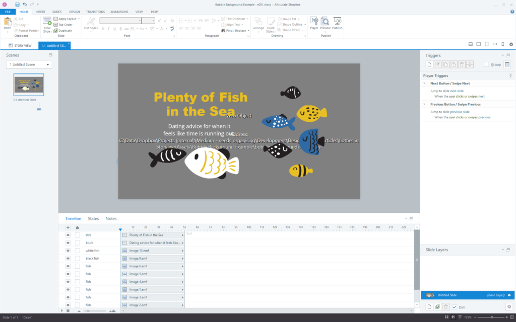
In the example below, the Lottie animation covers the whole background image. It includes animated bubbles that slowly float up behind the fish in a 27 second loop that is only 13kb. Because it is vector, this same animation can be used on any resolution project and it still only be 13kb.
It was also extremely easy to create because of the animation path editing available in After Effects and because of precomposition. The process involved animating only one bubble inside a composition and then duplicating and rescaling that composition around the main scene in After Effects. Because of this setup, it also means that if the style of the bubble needs changing, it only needs to be altered in that one composition and the rest will update.
The big drawback, however, is the way the file appears while editing the project in Storyline 360. Because the animation is designed to cover the whole background, it means that a grey box and it’s description text sit in the background under all other elements while editing. This can make working with the file more difficult and means that using a Lottie as a full background may not be worth the hassle every time.
The fish in the background were adapted from this seabed asset on Vecteezy.com
Feature image Lottie
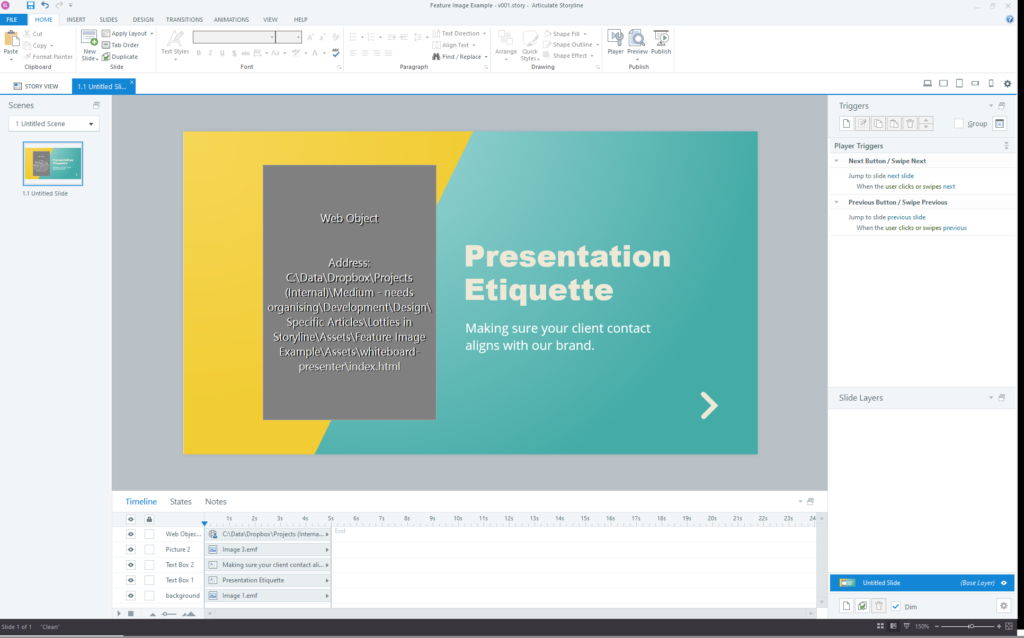
Instead of a background animation, in the next design, a Lottie animation is used as a feature image. Because the feature image sits separate from the background and other content on the page, the drawbacks of Lottie hindering the preview within Storyline are more manageable. The Lottie still appears as a grey box, but it’s not in the way.
The example also showcases utilising simple character animation in Storyline that would otherwise require some simplification or use of more limited filetypes. Lottie animations also loop (if desired) according to their own independant timeline that runs irrelevant of other Lottie animations on the page and irrelevant of the slide’s timeline in Storyline.
Interactive character animation
The next example involves more complex character animation (Inverse Kinematics). This is only possible to create outside of Storyline, and with Lottie we can use refined setups in After Effects and then bring the resulting animation into SL without compromising quality, transparency, or file size.
The example is incomplete to demonstrate another limitation of Lottie animations in SL. The animation is made of two different animations—one in which the person looks left, and one in which they look right. The animations sit on different layers that are each shown based on which button is hovered over. Unfortunately, even though the animations have already loading into memory, the simple act of turning on and off the different Lottie animations causes a visual gap while the graphic swaps.
Note: There may be some things that can be done prevent this, or different approaches that can be taken to avoid it, however, it starts to get complicated quickly and so is out of the scope of this article.
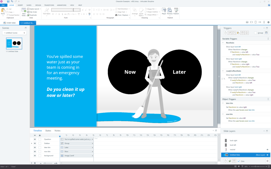
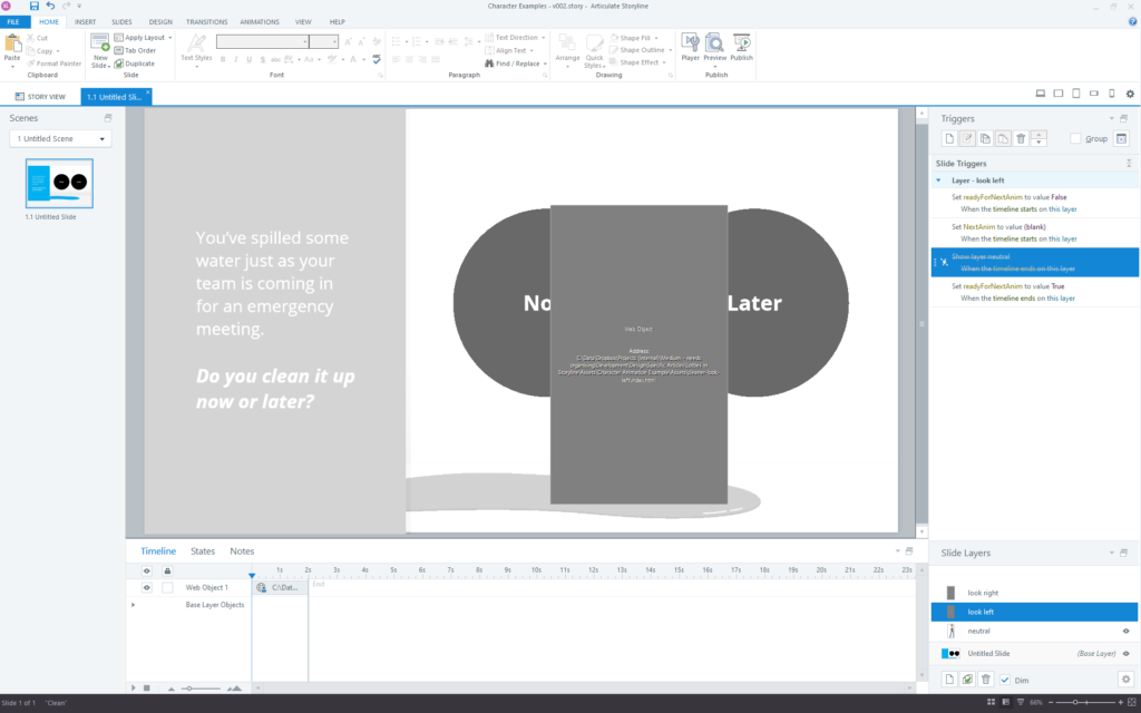
The above screenshots display the “Base layer” in Storyline as well as a second layer that overlays the “look left” animation. The main layer contains a static PNG of the character that is visible when the slide loads, and the design is therefore easier to work with in this state. The animation of the character looking left and right are placed on separate layers and shown selectively according to triggers based on rollover of the buttons.
Line animations
The below example shows an adjustment to the fish example from previously. In this version, the bubble have been turned into a more focussed stream in one part of the image. As such, you’ll notice that the grey box no longer fills the whole background – Whether this makes it easier to work with for you will depend on your process.
You’ll also notice that there are lines drawing on and the bubbles move slower. The lines use After Effect’s “Trim Paths” shape animation option and the speed of the animation is actually adjusted in the HTML file after exporting from AE. The Lottie is set to play at 25% of it’s original speed without any degradation.
The fish in the background were adapted from this seabed asset on Vecteezy.com
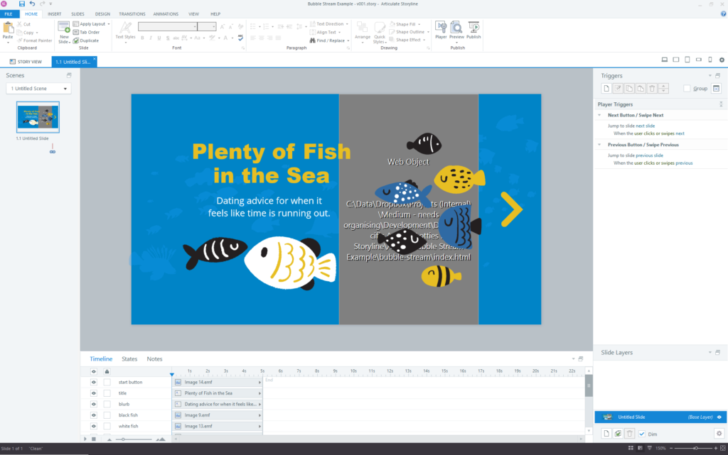
Suggestion: Try changing the speed in the HTML file and refreshing it in the Storyline file… Take note of how the first video suggests you refresh a Web Object and also note that if you preview the Lottie animation in Brackets you won’t see anything—because it will be white bubbles on a white background.
Preloading issues
One downside to Lottie animations in Storyline that are important to note, is that they don’t preload with the rest of the assets on the Storyline slide. This means that the slide can appear for the user and a second or two later, the Lottie animation can appear. In some instances, this can be a deal breaker, however, it can also be avoided with considered design.
Of the animations shown, the Presenter character has this loading issue because during his animation loop, he is visible the whole time. We could add a transition to the Web Object in Storyline, however, we can’t know how long to delay the transition for because he will load at different speeds on different computers.
Both bubble animations, however, don’t have this loading issue. This is because even though they still take some time to load, their animation starts off with an empty frame and the bubbles transition in. This means that even if the animation took 3 seconds to load, the user would not have a jarring experience, but simply see bubbles start floating from the bottom after 3 seconds.
You should test all these files yourself to understand the loading issues.
Note: There are potential ways around this loading issue even for the Presenter character that we’ll explore in another article.
That’s it!
If you’ve looked through the examples above, you’ll have noted that there are times when Lotties can greatly improve the animation in your Storyline project, but that there are also times when it’s impact on your ability to see the animations while working isn’t worth it. Because of this you’ll have to make a judgment about Lottie animations for each project your work on, however, hopefully this article has helped make the process involved a little clearer.
Thanks…
I also dissect and speculate on design and development.
Digging into subtle details and implications, and exploring broad perspectives and potential paradigm shifts.
Check out my conceptual articles on Substack or find my latest below.
You can also find me on Threads, Bluesky, Mastodon, or xTwitter for more diverse posts about ongoing projects.




Leave a Reply